
Seguros El Roble Refreshes Its Brand After More Than Five Decades of Service
Seguros El Roble introduces a new brand identity that reflects its digital transformation while reinforcing its commitment to innovation and customer trust.
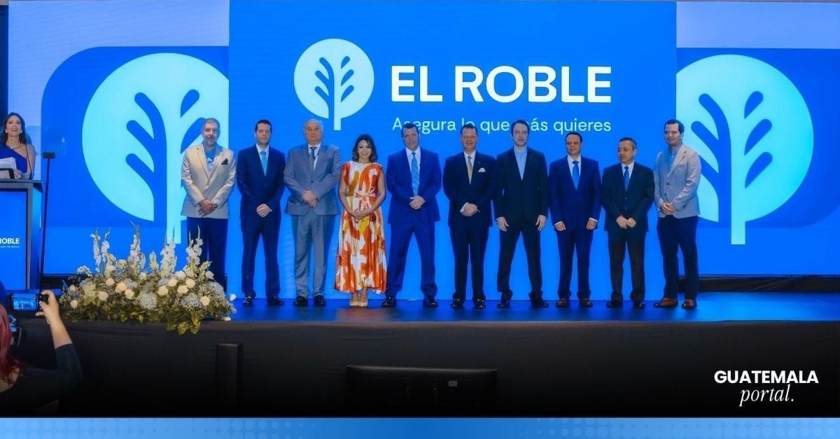
Seguros El Roble has introduced a new visual identity designed to represent the company's evolution while reinforcing its commitment to innovation, customer proximity, and trust. The rebranding reflects the insurer's vision for the future while preserving the values that have defined its more than 55 years of service in Guatemala.
The updated identity responds to changing customer expectations, as consumers increasingly seek faster, more digital, and personalized experiences from insurance providers.
A brand transformation beyond aesthetics
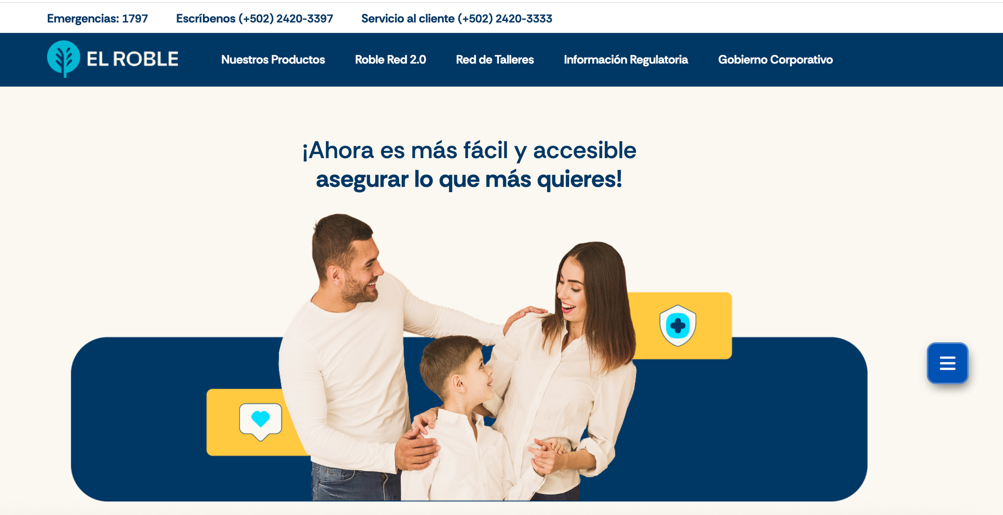
The company explained that the new visual identity is more than a logo redesign. Instead, it represents a broader evolution aimed at positioning Seguros El Roble as a more modern and accessible insurer while maintaining the essence that has shaped its history.
For more than five decades, the company has provided protection and support to Guatemalan families and businesses. As customer needs continue to evolve, the insurer says its brand must evolve alongside them.
Its purpose, "Protect What You Love Most," remains central to this new chapter, reinforcing the company's commitment to accompanying customers throughout different stages of their lives.
The creative process behind the new identity
The rebranding was developed in partnership with creative agency el taier DDB, with the objective of visually expressing the company's transformation while preserving the elements that customers already recognize.
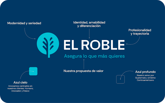
The oak tree continues to serve as the brand's central symbol, representing the strength, stability, and protection that have defined Seguros El Roble throughout its history.
However, the symbol has been redesigned with a more contemporary appearance that adapts more effectively to digital environments.
The refreshed visual identity also incorporates cleaner lines and modern design elements intended to communicate innovation, closeness, and ongoing support.
Colors inspired by Guatemala and the company's future
The new color palette was selected to reflect both the company's heritage and its future direction.
According to Seguros El Roble, deep blue symbolizes its connection to Guatemala and the Central American region while representing strength, experience, and trust.
Meanwhile, aqua reflects the company's commitment to digital transformation and innovation through customer-centered solutions.
The addition of yellow represents empathy, optimism, and the company's purpose of protecting what matters most to its customers.
Employees become part of the transformation
As part of the rebranding process, Seguros El Roble also focused on engaging its employees, emphasizing that a brand transformation involves the people behind the organization as much as its visual identity.
To mark the launch, the company organized an internal initiative called "Protagonists of Change," where employees were officially introduced to the new brand identity and the meaning behind its evolution.
During the event, staff members learned about the redesigned logo and updated branding elements. They also received promotional kits and new uniforms aligned with the company's refreshed image.
The initiative also recognized employees' contributions, highlighting their role in delivering the service quality and customer experience that define the organization.

Building on more than 55 years of trust
Throughout its 55-year history, Seguros El Roble says it has continuously evolved by investing in innovation, service quality, and employee development, establishing itself as a trusted insurance provider for thousands of families and businesses across Guatemala.
Over the years, the company has positioned itself as a source of stability during uncertain times while strengthening its reputation through consistent customer support.
Its new visual identity aims to capture that journey—preserving the values that have shaped the company for decades while preparing the brand to meet the opportunities and challenges of the future.


